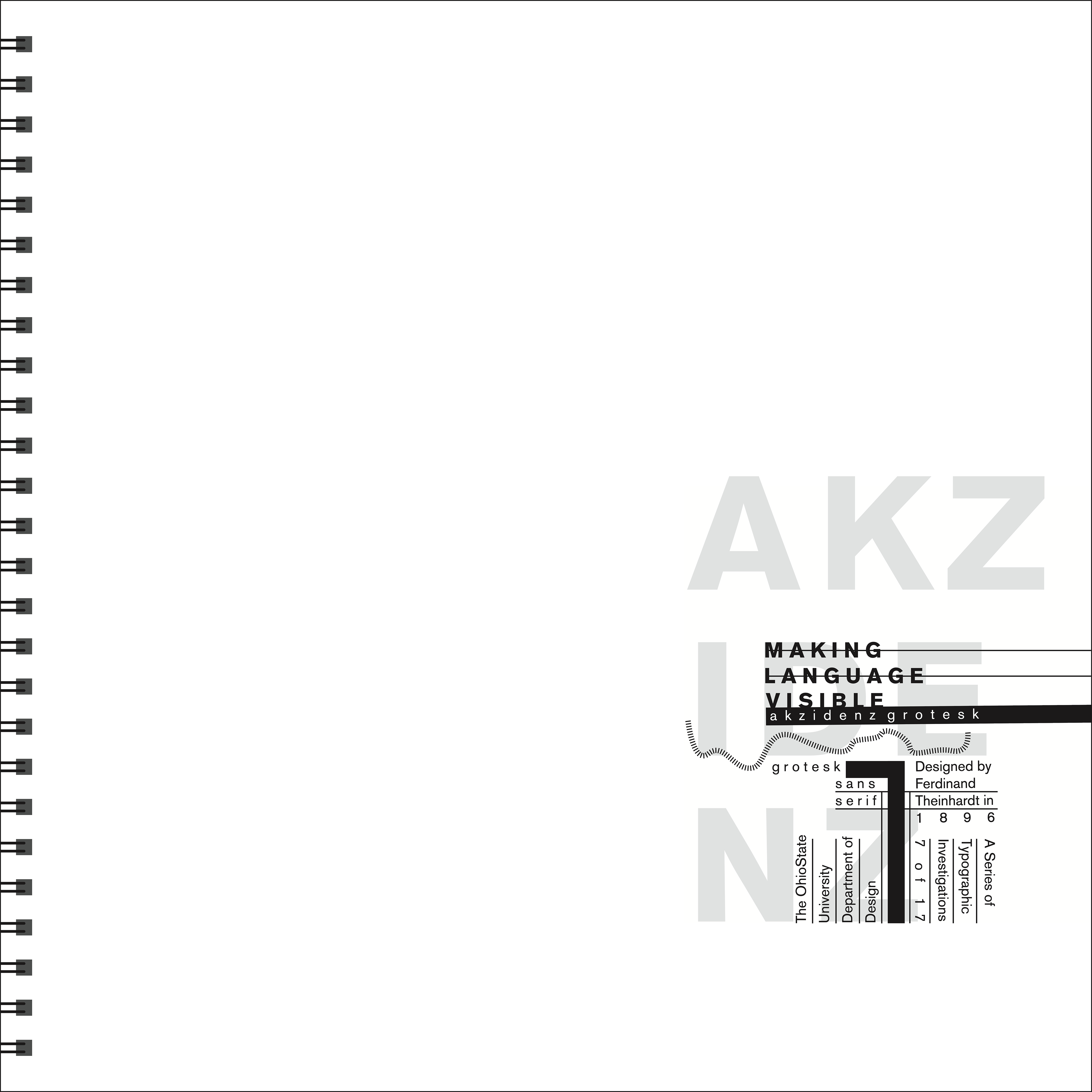
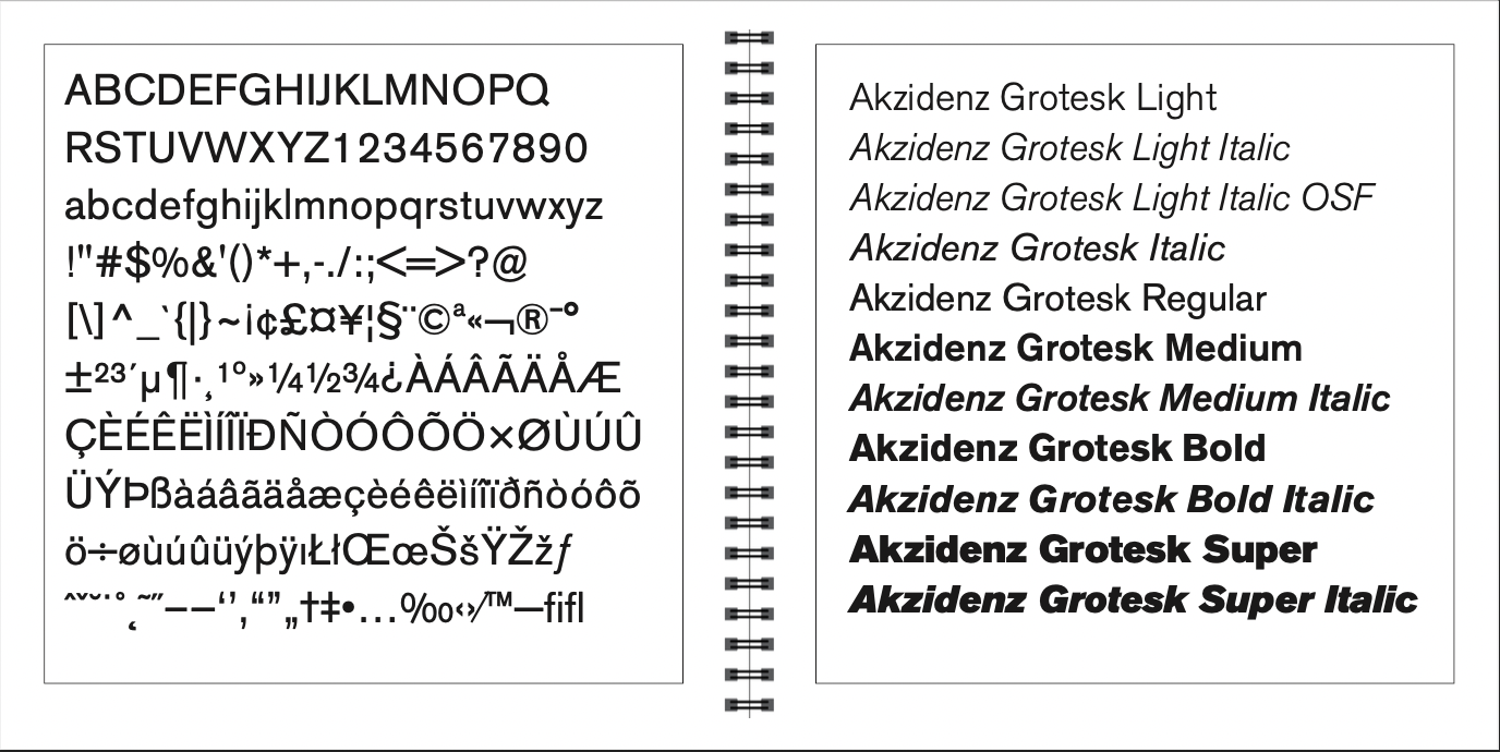
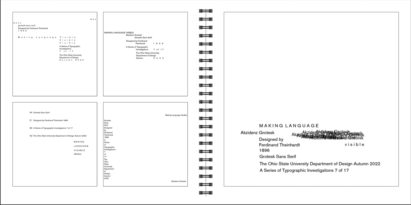
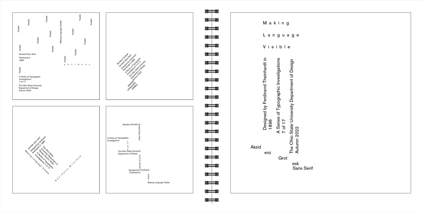
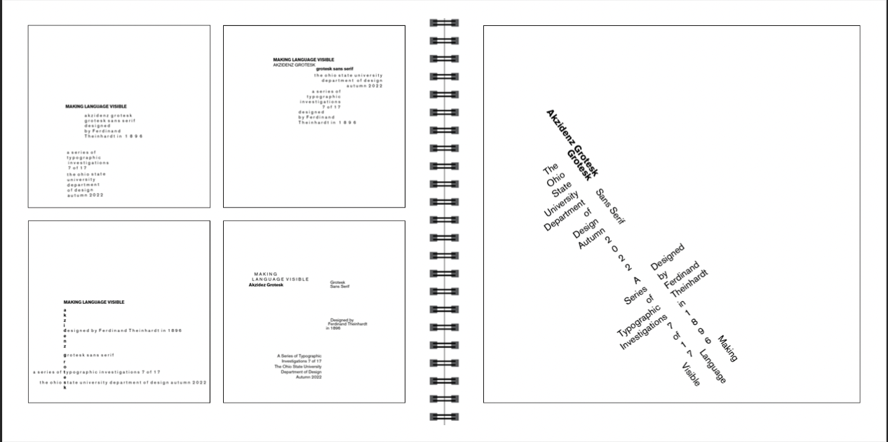
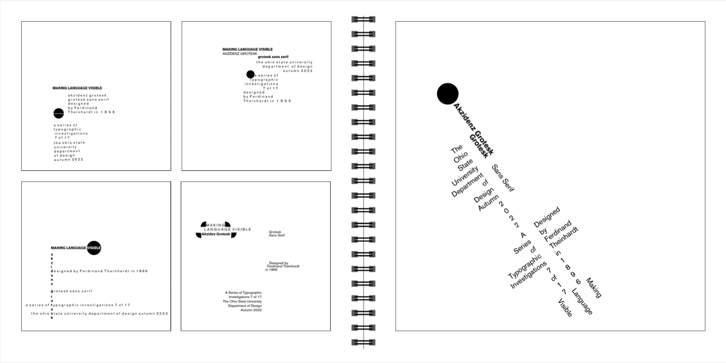
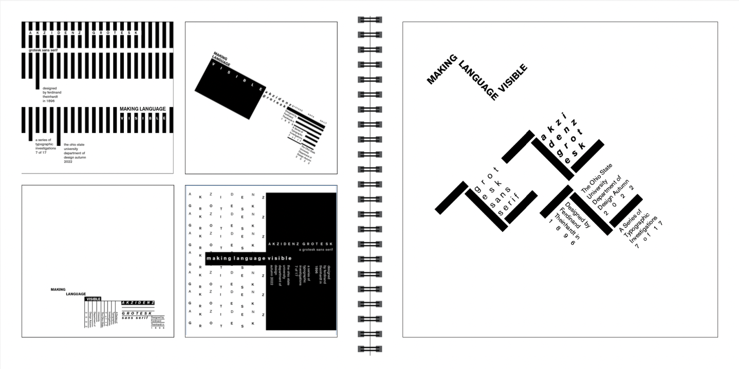
Objective
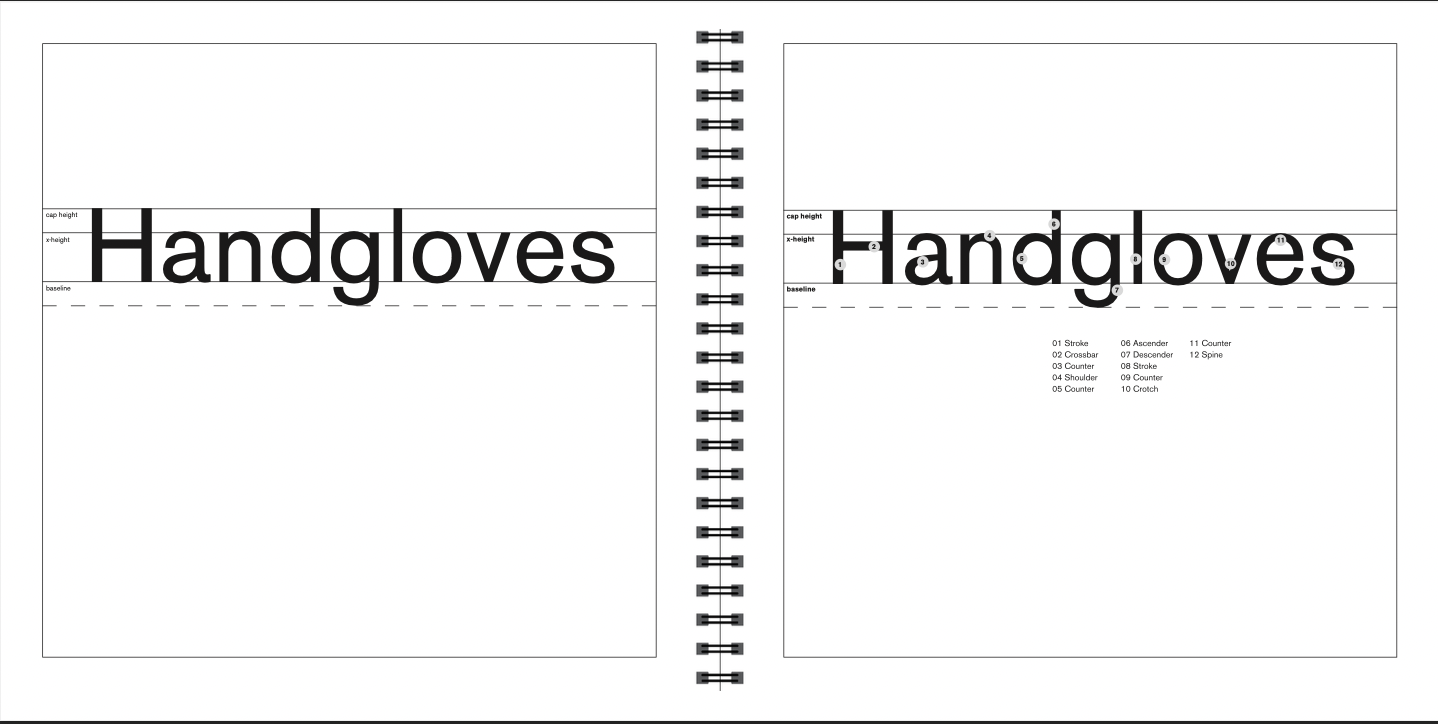
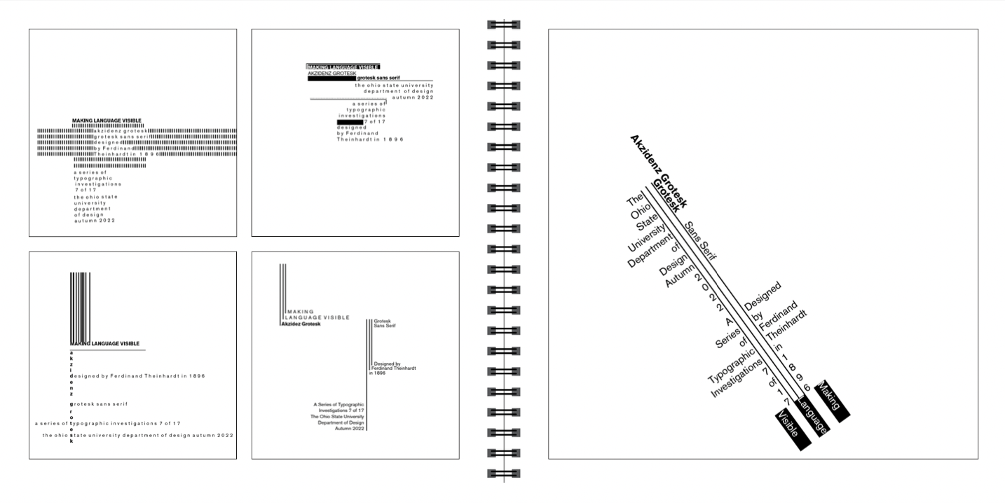
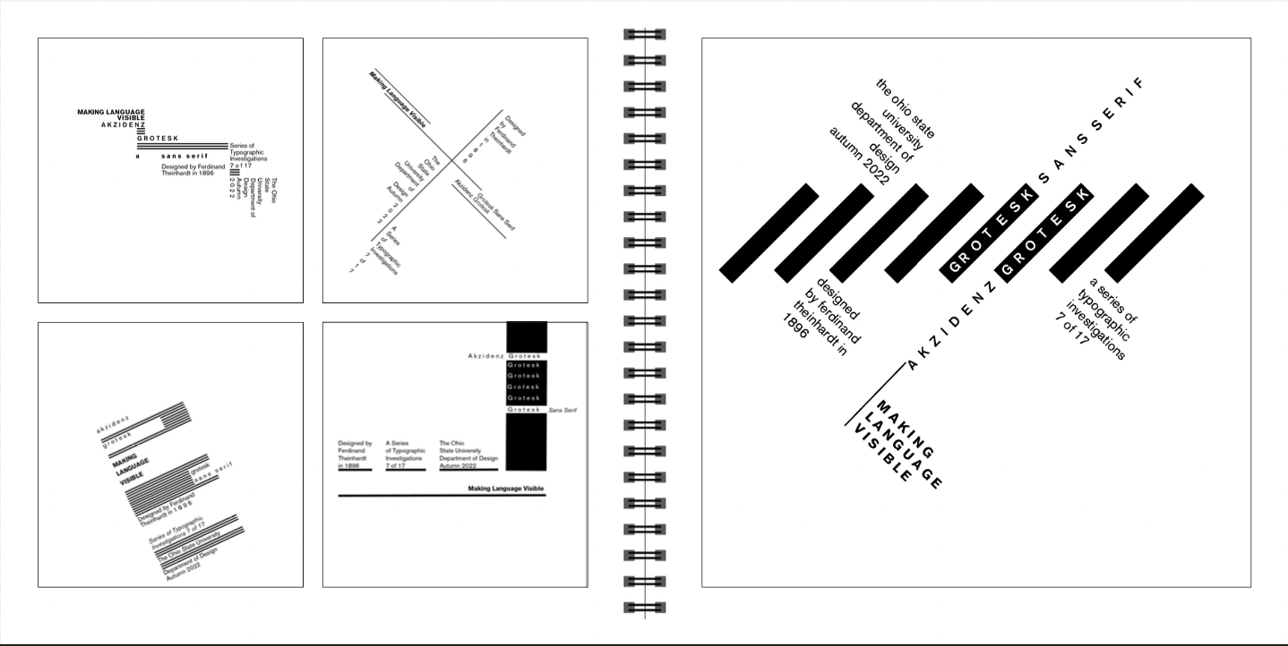
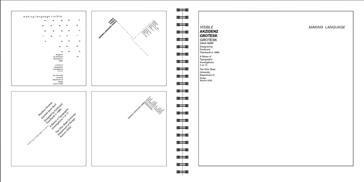
How do you make language visible? Using only the Akzidenz Grotesk font and adhering to specific rules and boundaries, I was tasked with presenting key information about this typeface in a clear and engaging way. Through this process, I gained valuable insights into visual hierarchy, learning how to organize content in a way that guides the viewer’s eye and emphasizes key details.
Approach
I explored the balance between typography, spacing, and alignment to create a composition that is both aesthetically engaging and functionally clear. This project challenged me to think critically about how design choices impact readability, legibility, and overall user experience, reinforcing the importance of structure and intentionality in visual communication. The result of the final deliverable was to take all of the compositions from the whole semester and create a physical book.